Friday 14 October 2011

The Notebook – Title Sequence

The Notebook is a romance film. It is about a couple from the 1940’s who had a very passionate love, and then it switches between past and present.

It starts out by showing a black background. During this there is playing the non-diegetic sound of the piano playing a soothing tune. Then it fades into a beautiful wide angled shot of an orange/red sunrise in very warm colours. Which in some cases can mean blood and devil but here it means love.

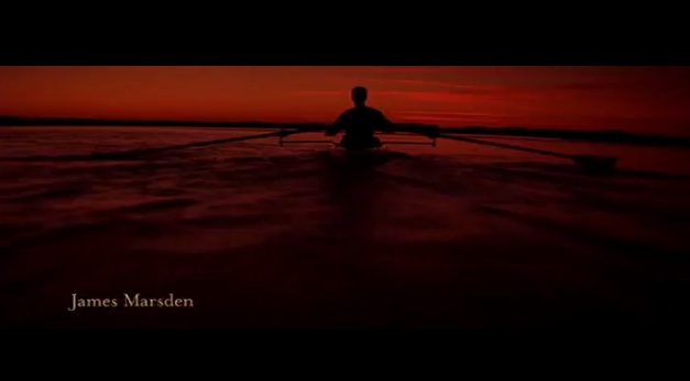
When the sunset appears the name of the first actor appears ‘Ryan Gosling’ in the bottom left corner. It is written with a ‘thin’ font. It is written in a certain way that is to remind the audience of a notebook, which is the title of the movie, and what the whole movie is about. The fonts are continuous, with the same writing fading in and out, when it comes to 0.56 in the title sequence the writing switches from the left bottom corner to the right but is still subtle and doesn’t take any attention away from what is being shown to the audience.


The music is continuous. It is the soothing sound of a piano that is very romantic and calm which lets you take in the moment of the scenery you are shown through the camerawork. Aaron Zigman composes the music. In this part of the title sequence the piano is non-diegetic, but we later come to find that one of the main characters plays the piano so all this beauty we are shown ends up having us think about that character in a certain way.

The camerawork is very slow, with some very long shots. This is done to create atmosphere. So you feel like you are there in the moment and that you are ‘being allowed’ to take it in. It is filmed in a form of slow-motion, letting everything glide in to each other. The shot following the boat (0.36 to 0.45) is done so you’re actually following the person, not just ‘watching’ them sail. You feel like you are sailing as well, feeling the water pass you by. Again the sailing reappears later in the movie as well so when you watch it later unconsciously you will link it to this. The camera is panning (0.54 to 1.08) again to give you the feeling of the situation. You have two people in this shot the one person you can’t see, it is just a silhouette to keep your main focus on the scenery and the moment, so your mind doesn’t have to be bothered about thinking who that was.


Towards the end we get a long slow shot of some birds flying towards a house. Then it switches to an over the shoulder shot so we can see that there is a person looking from the house out on what we saw from the back and then it switches back to the birds. Then back to the woman where you can see then woman again and then the scene ends when the last bird has flown away.

Title Sequence

http://www.youtube.com/watch?v=558rexgg3ew


Thursday 13 October 2011

Memento Title Sequence

This movie is an American psychological thriller based on a man who has short-term memory, and uses Polaroid’s, tattoos and notes to keep focus. He is trying to find the man who killed his wife.


The first thing you see is a black background with the title of the movie on it ‘Memento’ written in blue. Then the background fades into the first image of the scene which is a person holding a Polaroid picture taken of a dead man with blood everywhere. Like in the title sequence se7en because we don’t see his face to start with we are focusing on the picture and what is happening with it. Unlike the precious title sequences the text of this one is continuous. The same font throughout and it keep appearing in the same place in the middle of the screen in the same blue colour. I think this is done so you still keep a main focus on what is happening in the scene, but you still see the credits. 


This title sequence is done over one very long shot, what happens in it is that every time he shakes the Polaroid, instead of becoming clearer as a normal one would do, the colour washes away. As if time is going backwards instead of forwards, which has a huge meaning for the whole film. So the reason for doing everything else so simple is so that you really take your time to take in what is happening, giving you time to think why.
The music is non-diegetic and gives you the emotion of feeling very sad, while you are watching this picture of a dead person mixed with the cold colours in the blue writing. There is also diegetic sound where he shakes the photograph and you hear the sound of it.  


The Title Sequence - Watch from 0.00 to 1.15

Monsters Inc. Title Sequence

This is a title sequence from the animated movie Monsters Inc. Which is basically about monsters, in a monsters world, that live of going into kids bedrooms scaring them and use their screams to fuel their city with electricity. It might sound scary but trust me this is a feel good movie. The way they get to the kids is that in there factory ‘Monsters Inc.’ the have door, hundreds of doors, that leads them directly to kids bedrooms. Hence the doors that are portrayed in the title sequence.'


I’m not quite sure who has designed this title sequence, but whoever it was, they were definitely inspired by Saul Bass. You can even compare it to “The Man With The Golden Arm”. They both start out with the sound of a high hat, and continue with jazz music. There is also a lack in continuity in where the text might pop up and what kind of font it is written in. In ‘Monsters Inc.’ It is written different times each way and quite childish because it is a movie for children. There are also a lot of colours, this is probably if you aren’t that old to relate to the words, there is more to look at.  

There is a mix between the non diegetic (Jazz) and the diegetic sound, for example at 0.26 in the sequence where the monster screams. From 0.31 is a good example of how the picture follows the sound and the beat of the music. This whole title sequence ‘prepares’ and represents what you are going to see in the movie. With all of the images of the doors, combined with the kids’ closets and the monsters roaming around the letters. At 1.23 the music switches from the up beat jazz to a piano before it switches from the sequence to the actual movie.  


Saul Bass – Title Sequence The Man With The Golden Arm

Saul Bass (1920-1996) is known for his animated motion picture title sequences, the same profession as Kyle Cooper. One of his most famous title sequences is ‘The Man With The Golden Arm’.
The plot in the movie is about a man named ‘Frankie’ (Frank Sinatra) that was a heroin addict but became clean in prison, with the dream of becoming a drummer. Throughout the movie he gets pressured to start taking drugs again, and with this in mind it reminds us of the title sequence.

We see white paper cut-outs come from the top of the screen and down. 3 out of 4 of them disappear and then there comes one from each of the four sides on screen. Then in the middle of these four ‘needles’ the name of the movie flashes up ‘The Man With The Golden Arm’. You feel the pressure of the needles moving into the screen and out intact with the music increasing which is to resemble how pressured he must feel, being forced into drugs again having needles pushed in his face.


The ‘view’ is quite simple colour wise. Black background with white righting and the cut-outs being white. The text is written with a quite standard font with the actors names written in capitals. Like Kyle Cooper there is a lack in continuity where the words are going to pop up and where the needles are coming from making you unsure again to represent the pressure he is under and to make you feel like you are on the drug and it’s increasing more and more. At the end of the sequence all of the needles form into a white arm to represent ‘The Man With The Golden Arm’ where you reach your ‘highness’ and were the music is most tense. 


The music is non-diegetic. It has a jazz feel to it and is played by Shorty Rogers. It starts out in the beginning of the sequence with only a high hat from a drum set, and then a couple of seconds after the beat comes on. From 0.28 the music speeds up as if you are on the drug and it’s effect on you is increasing. The music is most tense where all of the needles form into one arm, and that ‘shot’ is held for a really long time, because it is the whole plot of the movie.     


Here is the title sequence

Tuesday 11 October 2011

Kyle Cooper – Title Sequence Se7ven

Kyle Cooper is a title sequence designer. He designed the title sequence for the crime movie Se7en in 1995. He has said that when he made the title sequence he wanted to raise the bare creatively for that kind of work. He definitely achieves this in those two mind-blowing minutes. And these two minutes I’m going to tell you all about.

I want to start with what we actually see before I get to the music. There happens a lot in these two minutes, if you watch it once you’ll probably end up thinking that it was quite confusing and have a lot of questions but if you look closely you get the opposite a lot of information.

The hole sequence is close ups, which makes the audience think about what he is doing rather than who the person is. In the begging we see a book with empty pages that as wee see later get filled up. It starts out with a picture of some hands, were afterwards he razors his finger prints off, so that whatever he is doing cannot get traced back to him. He is planning something and is putting a lot of effort into it. He is preparing this book which probably is going to be used later in the movie as an explanation. We see in some of the shots that he is crossing out words in a text like pregnant, intercourse and transsexual which could mean that he is very religious and in some way finds it offending and wrong.

The actual titles in the movies start out as if they’ve been written on a typewriter like the one I am using now. But this is only with the titles like ‘New Line Cinema Presents’. When it comes to the names, for example when it says Brad Pitt it is probably the smallest his name has ever been written in a movie. It doesn’t look typed, it almost looks as if it has been hand written on a paper and then scanned in. The way it’s written reminds us of the way that the character is writing in the sequence. When the names come up they are written in white, and they all are written differently. Some are close together some far apart. The text lights up and mirrors itself; sometimes it looks like it’s being scanned. They are all different places they don’t just come up in the middle and then goes on to the next one. Meaning that there is a lack of continuity and that adds a lot of confusion to it.


There is used the colour red, which is very common in a crime movie. At 0.50 there is a drop of blood falling on to his paper. There is also used red lighting sometimes, or after the normal colour of the picture has been shown it comes back again in red and then we are shown some film after. This could mean that he is developing some pictures that he has taken and developing them in a dark room, before he sticks them in his book.


The light flashes as if it came from a camera. In the beginning we see a close up of a dollar zoomed in on the writing ‘In god we trust’ in which he later cuts god out of. By being shown the same images we feel how he has progressed through is work. As it is shown where the god word is cut out, in the music they say ‘you get me closer to god’ and then it stops.


The music is very intense. You could get the chills from hearing it, without watching the scene. So when you do put it together it strengthens the moment. There is a specific beat in the music throughout but there is added more sound the further you come in the scene it specifically starts from 1.13. It is right when we see a picture of a person who’s eyes he has just crossed out, and then it cuts to where he has crossed out the whole picture. In the music there is a sound that I think sounds like a forwarding sound, which relates to when they film him writing you see it and then it cuts to were he has written further even though you can still se the old clip.


Here is the title sequence

Preliminary exercise/Main task

Preliminary exercise: Continuity task involving filming and editing a character opening a door, crossing a room and sitting down in a chair opposite another character, with whom she/he then exchanges a couple of lines of dialogue. This task should demonstrate match on action, shot/reverse shot and the 180-degree rule.

Main task: the titles and opening of a new fiction film, to last a maximum of two minutes.
All video and audio material must be original, produced by the candidate(s), with the exception of music or audio effects from a copyright-free source. Both preliminary and main tasks may be done individually or as a group. Maximum four members to a group.

What is a thriller?

When you want to watch a thriller movie it’s either because you want to get a good scare or because you want to watch some action. Of course there are different takes on thrillers as well but these are the two main ones I would think. With any movie you put on you have an expectation to what your going to watch so if you paid to watch an action packed thriller and Winnie the pooh came on I think you would be a bit disappointed and probably wouldn’t come back to watch another movie made by that director or movie distributor which would lead to them loosing their audience. In thrillers there are often the classic conventions of guns, cars, point of no return, action scenes, scary sequences..
This is a thriller that i find very entertaining:

Tuesday 4 October 2011

Preliminary


We were given a double paged paper, with different forms of shots on them like, over the shoulder, wide shot and so on. With each of these images there were sentences. We created a storyline to go with these images and sentences.
We chose to film in the editing suite. Tom was filming, Julia and Sadie were cardholders and continouity people and Fady and I were the actors from the story board. We all helped each other with the different roles, working as a team. We had some obstacles while filming. For example while we were filming our ‘Card Holders’ (the people with our lines) we could see their reflection in the TV, therefore we turned the screen white, that messed up our white balance a bit, plus our cardholders had to move.

We made marks for ourselves so, we would hit the same spot over and over again, and to make the editing easier, to make the cuts fit together. We just used inside artificial light, to light our scene. We did the same takes continuously to make sure that we got all of the footage right.

We did not break the 180 degree rule, and kept it, by a lot of over the shoulder shots, wide shots and close-ups. We had our continuity people making sure that everything was continuous that nothing suddenly changed like a door was open in one shot and then closed in another. Then when we had gotten all of our ‘real’ shot, we played around with the ‘guy’ walking with the camera while he walks into the room, and did a close up of my shoes while I’m tying them, which actually worked very nice during the editing process.

We chose to edit the pre-lim in a way so that it ran smooth through without you noticing the cuts. It was tough using Final Cut Pro because it is so professional but once you get used to it you find out that it is easier than you think.
http://www.youtube.com/watch?v=ZBlVOGvXQKg&list=PL79FA2CDCC7C73B62&index=3&feature=plpp_video